How to confuse people
At Woking Leisure Centre, people are often stopped by the turnstiles where you have to swipe your membership card.
Some years ago Sarah and I wrote and presented a paper on interface design:
"Profiling API usability for consumer electronics software"
Its theme, as is so much that I write, was quite simple: that an interface could be judged (quantitatively, in that paper) based on simple measures of how much effort you had to put into using it.
(An API is an Application Program Interface - a defined way in which software is to be structured and used.)
Interestingly, on checking our paper on interface design before writing this blog, I see it has been much cited in later work, which is gratifying.
We based our work on observations from Microsoft, who put a lot of effort into designing interfaces for programmers using their programming tools. That work - and ours that leveraged it - was in turn based on psychology: specifically the psychology of Cognitive Dimensions, which seeks to measure and specify how individuals think, react, and use things.
Anyway, at Woking Leisure Centre you have to swipe your membership card to pass through the turnstiles: and very often there is a bit of a kerfuffle because people either can't swipe their card, or it doesn't work.
Being of an inquiring mind, and interested in interfaces, I looked at why the card swipe interface should cause so much trouble.
The problem is quite simple: the card swipes are back to front and on the wrong side.
Normally, you expect to swipe a card on your right - because most people are right-handed, and so are machines designed for most people. The Woking Leisure Centre card swipes are on the left - so people passing through the left hand turnstile accidentally swipe their card on their right - which is the card swipe for the right hand turnstile.
When you realise the card swipe is on your left, you have to twist to your left to use it: which leaves you in a twisted position from which it is difficult to untwist to go through the turnstile.
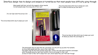
Just below the card swipe is a big illuminated arrow, pointing forwards. So most people swipe their card in that direction. Bit that big bright arrow is not to tell you which way to swipe your card: it is to show you where the card swipe is.
The arrow telling you which way to swipe is a small one, in back on black, at the top of the swipe itself: so most people don't see it. Helpfully they have pasted a diagram and instructions beside the card swipe: so if you look at those you will see a red arrow pointing the way your should swipe your card.
So you swipe your card and it doesn't work. Because the card swipe is back to front, so your card has the magnetic strip on the wrong side.
So there is a diagram, and some words, to tell you which way round to hold your card and which direction to swipe it.
First Rule of Interface Design: if you have to be told how to use it, then it isn't very good.
Our measure of interface usability, at its simplest, counted how many things you had to do to use an interface: the less, the better. In this one you have to:
Not counting the probable additional actions of bumping into the locked turnstile, stepping back onto the toes of the person close behind you, and calling out to reception for advice,...
Some years ago Sarah and I wrote and presented a paper on interface design:
"Profiling API usability for consumer electronics software"
Its theme, as is so much that I write, was quite simple: that an interface could be judged (quantitatively, in that paper) based on simple measures of how much effort you had to put into using it.
(An API is an Application Program Interface - a defined way in which software is to be structured and used.)
Interestingly, on checking our paper on interface design before writing this blog, I see it has been much cited in later work, which is gratifying.
We based our work on observations from Microsoft, who put a lot of effort into designing interfaces for programmers using their programming tools. That work - and ours that leveraged it - was in turn based on psychology: specifically the psychology of Cognitive Dimensions, which seeks to measure and specify how individuals think, react, and use things.
Anyway, at Woking Leisure Centre you have to swipe your membership card to pass through the turnstiles: and very often there is a bit of a kerfuffle because people either can't swipe their card, or it doesn't work.
Being of an inquiring mind, and interested in interfaces, I looked at why the card swipe interface should cause so much trouble.

The problem is quite simple: the card swipes are back to front and on the wrong side.
Normally, you expect to swipe a card on your right - because most people are right-handed, and so are machines designed for most people. The Woking Leisure Centre card swipes are on the left - so people passing through the left hand turnstile accidentally swipe their card on their right - which is the card swipe for the right hand turnstile.
When you realise the card swipe is on your left, you have to twist to your left to use it: which leaves you in a twisted position from which it is difficult to untwist to go through the turnstile.
Just below the card swipe is a big illuminated arrow, pointing forwards. So most people swipe their card in that direction. Bit that big bright arrow is not to tell you which way to swipe your card: it is to show you where the card swipe is.
The arrow telling you which way to swipe is a small one, in back on black, at the top of the swipe itself: so most people don't see it. Helpfully they have pasted a diagram and instructions beside the card swipe: so if you look at those you will see a red arrow pointing the way your should swipe your card.
So you swipe your card and it doesn't work. Because the card swipe is back to front, so your card has the magnetic strip on the wrong side.
So there is a diagram, and some words, to tell you which way round to hold your card and which direction to swipe it.
First Rule of Interface Design: if you have to be told how to use it, then it isn't very good.
Our measure of interface usability, at its simplest, counted how many things you had to do to use an interface: the less, the better. In this one you have to:
- notice the card swipe is on the wrong side
- twist to the left
- realise the big arrow is not the direction to swipe
- turn your card round so the stripe is on the right side
- swipe the card
- twist to the right to go through
Not counting the probable additional actions of bumping into the locked turnstile, stepping back onto the toes of the person close behind you, and calling out to reception for advice,...
Comments
Post a Comment